

Arper's corporate id
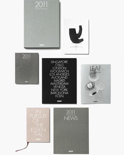
Catalogs
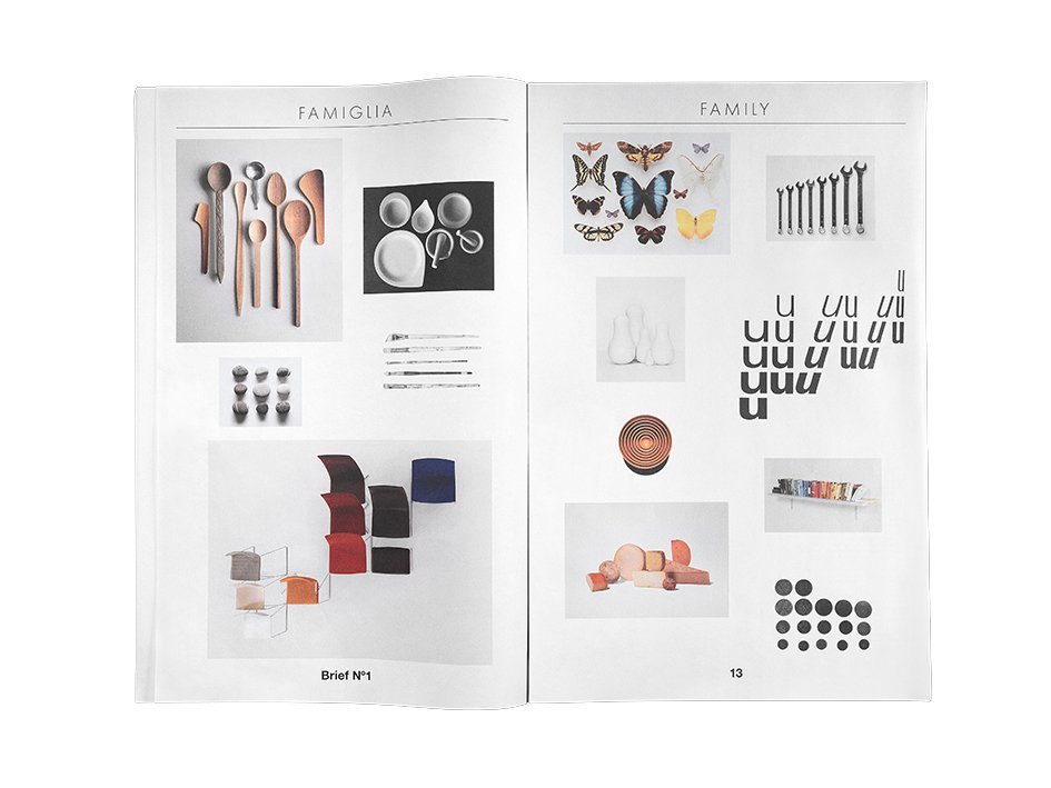
Arper S. p. A.The key to Arpers design philosophy is synthesis, harmony, systematic formal rigor and customization, color, play and a mindfulness toward the environment. The goal was to extend these values from product design via corporate culture to an integrated communication system that broadcasts a unified, coherent and inspired message to its target audience. The project - carried out in collaboration with design firm 2X4 and Lievore, Altherr, Molina- involved an evolution of the companys brand language and corresponding graphic identity. The esthetic of Arpers communications is pure, refined, playful and pragmatic. The new graphic language uses the building blocks of historical modernism, in particular Helvetica and Futura, in a bold, contemporary way, creating a clear and stable frame to showcase a lyrical and informative narrative about Arpers products and culture. Photography created by Scheltens & Abbenes helps to articulate this message. These images describe the design systems, modularity, diversity of options, and ethos inherent in the form of each product collection.


