

MOX - The culture of failure.
Corporate design for the Museum of Failure
Museum of Failure, Inc
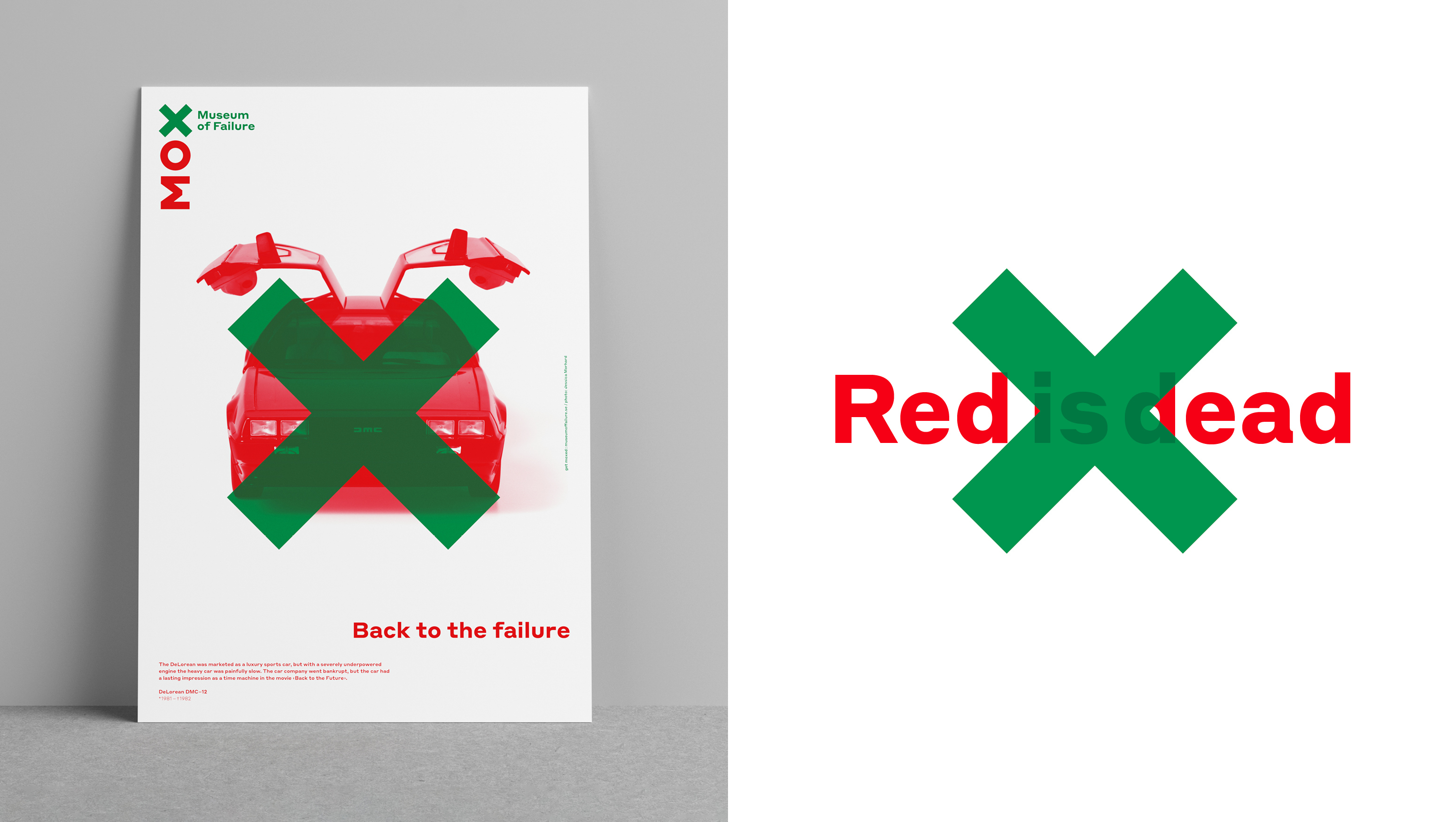
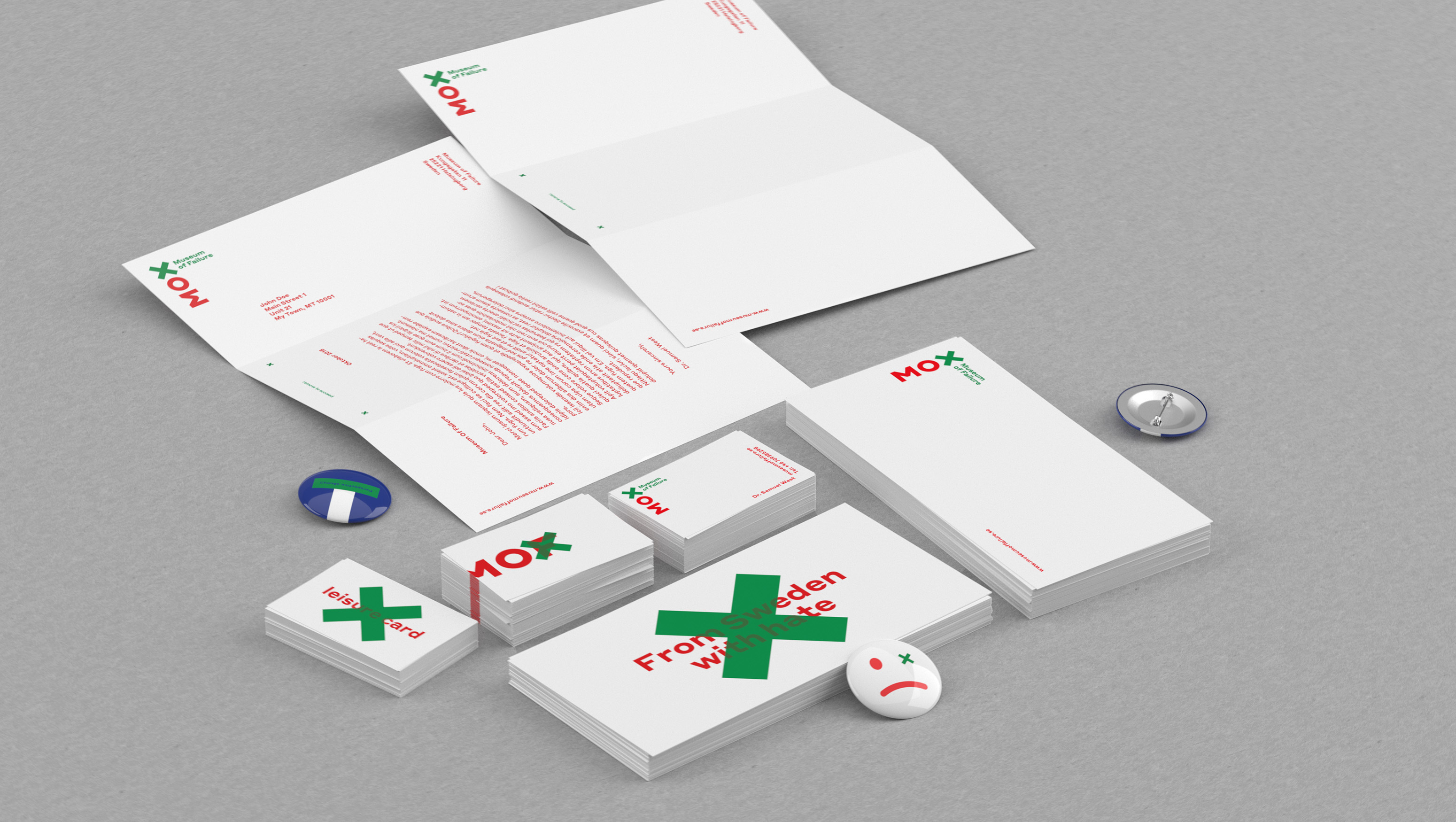
Many of the greatest successes were born of initial errors and failure. The Museum of Failure in Carson City, USA presents a large collection of failed products. Because for every great success like the iPhone, there were more than a few potential Edisons who failed. The corporate design for the museum plays with the idea of failure giving birth to success. The logo design merges two classic symbols: a green tick representing a correct answer, and a red X representing an error. The result is a green X, representing the creative power of failure, in the acronym MOX, shorthand for Museum of Failure. Throughout the museum’s communication, the green X is used to cross out red images of failed products.
iF Gold Statement
For every success, a long line of failures - the thick green 'x' in the Museum of Failure's brand design symbolizes how important getting it wrong can be. At the same time, the piece toys with the red-green color blindness that obscures the view of the whole. This clever graphic design encourages us to see a possible solution in every mistake.
Client / ManufacturerDesign
Museum of Failure, Inc
Carson City, US
Grey Germany / KW43 Branddesign
Düsseldorf, DEDate of Launch
2018
Development Time
up to 12 months
Target Regions
Europe, North America
Target Groups
Consumer / User