

Geometric sans!
Book
TRADEMARK PUBLISHING
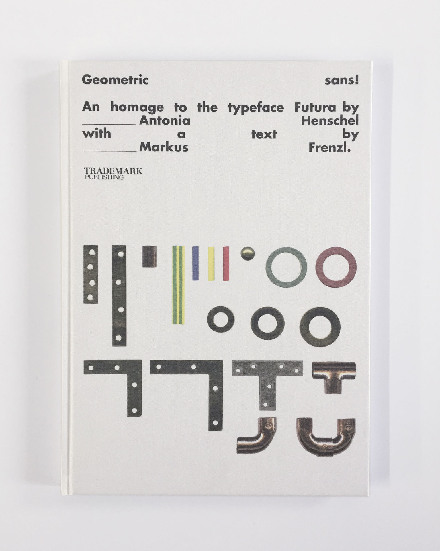
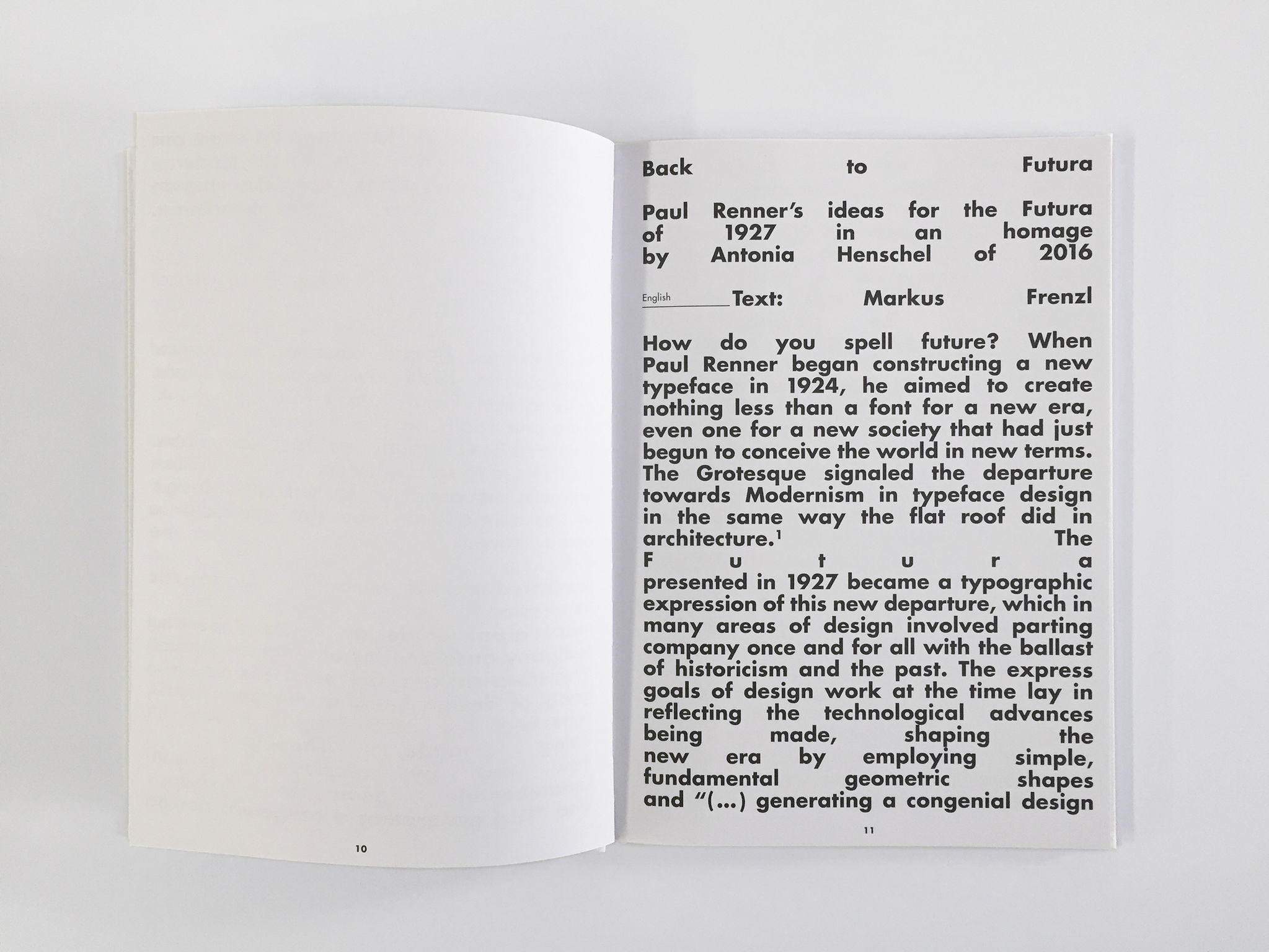
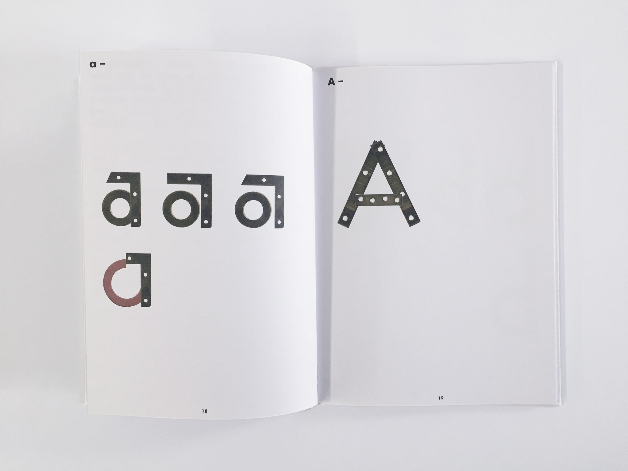
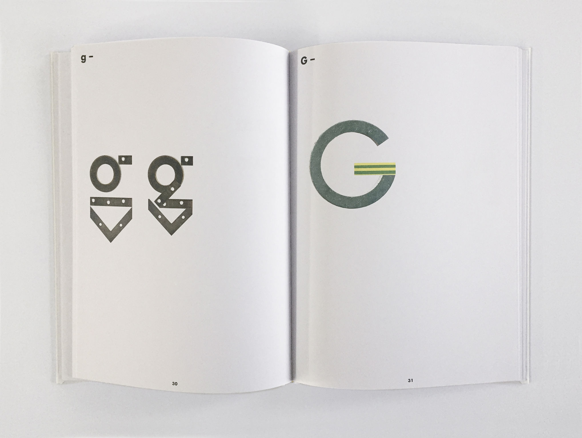
Is one allowed to go to a DIY store to pay homage to one of the most famous fonts in the world? Buying loads of copper pipes, sockets and hole angles? Most certainly. "Geometric sans!" proves how wonderfully playful and fascinating typography can be. In his short essay design critic Markus Frenzl highlights the history of the font Futura. This is followed by the alphabet: Antonia Henschel shows all letters with the simplest finds from the DIY store "Bauhaus." Geometrically exact and above all based on the original drawings of Futura by Paul Renner. Geometric sans! is a tribute to this typographical success.
Client / ManufacturerDesign
TRADEMARK PUBLISHING
Frankfurt a. M., DE
Sign Kommunikation GmbH
Frankfurt a. M., DEDate of Launch
2016
Development Time
up to 12 months
Target Regions
Asia, Europe, North America
Target Groups
"Typographers"