

adidas laces
Signage system
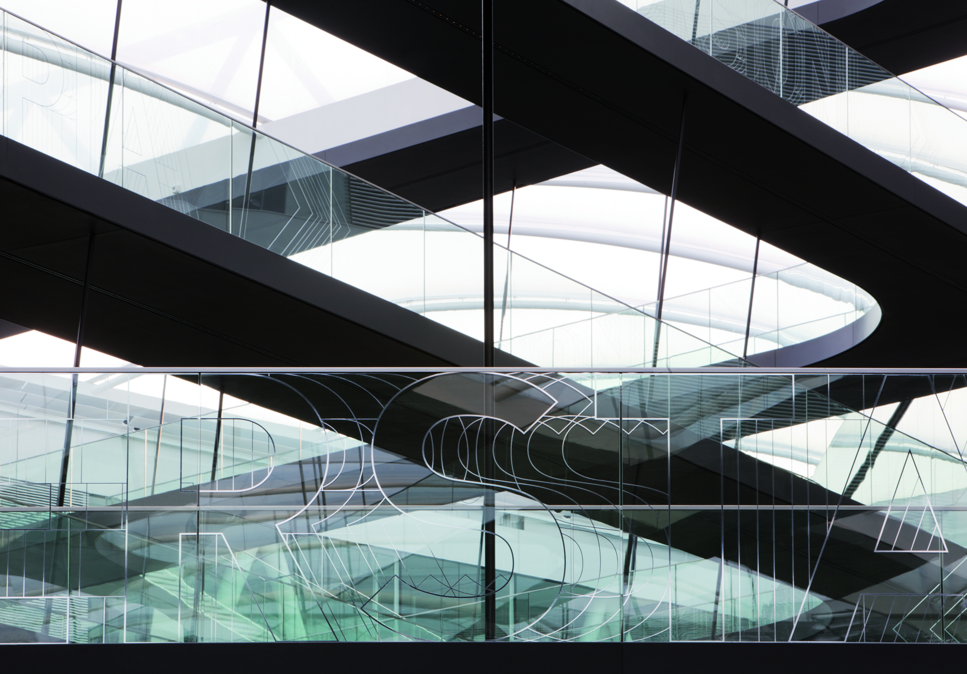
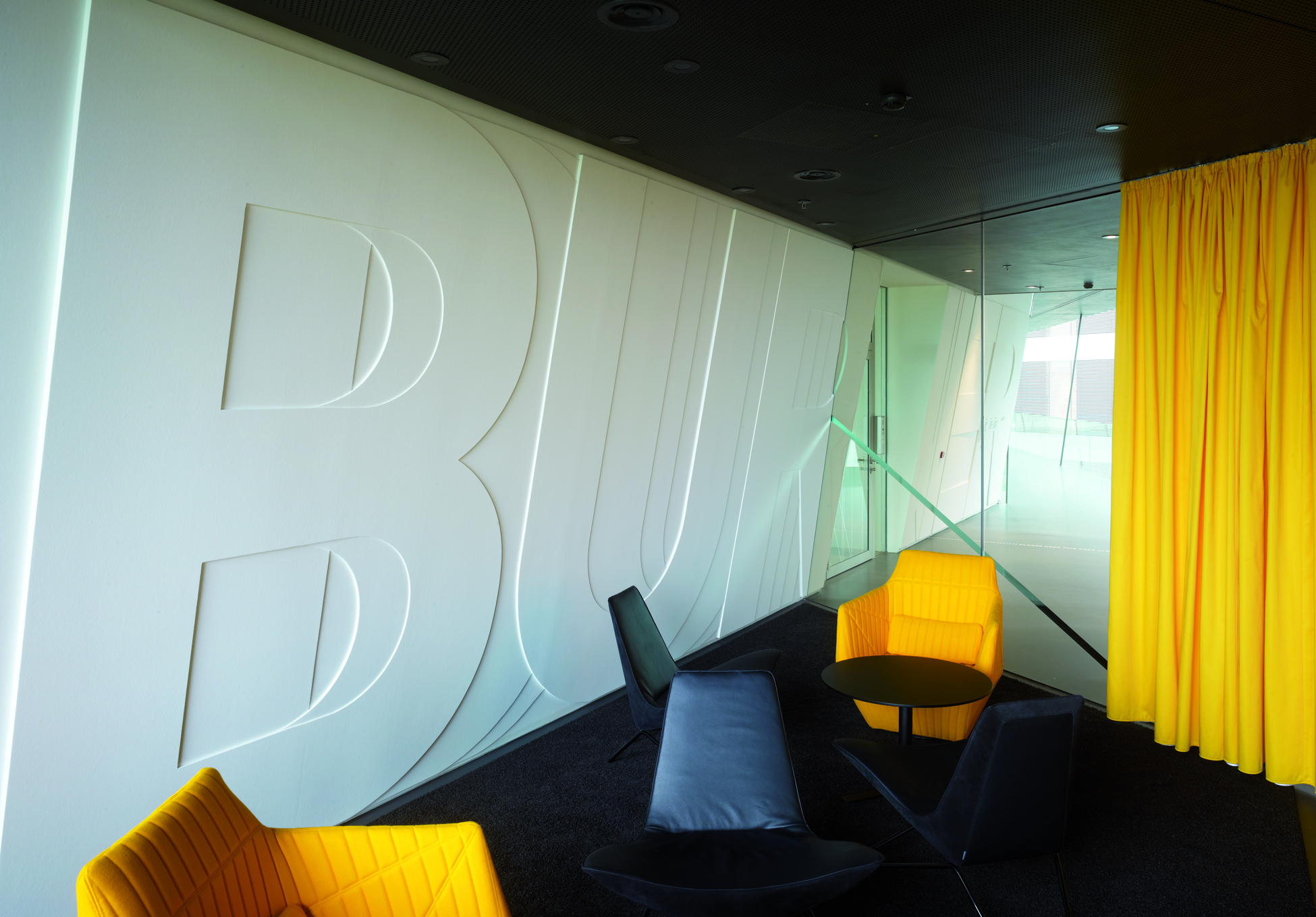
adidas AG World of SportsLiving letters, turbocharged typography: the name “laces” has a metaphorical value, capturing what the building says about the networked communications of a globally active corporation – a market leader in the development of sports goods and apparel. Movement is the essence of sport – and movement also defines the design language: turbocharged typography runs through the new adidas design center. It is also reflected in the typeface of the signage system: fast and light, it leaps and bounds across walls and balustrades, its form vibrating and altering in the process.
iF Gold Statement
Laces convinced us in a very special way: an extremely dense and highly convincing translation of the architecture that was found, and Adidas as a sporting goods manufacturer representing dynamics, movement and sports, has been achieved here. The metaphor of movement, of the laces works in a very special way and beautifully harmonizes with the typography of the orientation system as a whole.
Client / Manufacturer Design

adidas AG World of Sports
Herzogenaurach, DE