Cookies and the protection of your data

We use cookies to improve the functionality of the website, to offer you a better website experience and to provide social media features. You give your consent by clicking on “Accept all Cookies” or as part of your individual settings. Please find detailed information on the use of cookies on this website in our Data Privacy Statement.

Functional Cookies

These cookies are necessary for the operation of the site and enable security-relevant functions. In addition, we determine whether you want to remain logged in and to make our services available to you when you change between this and other websites.

Statistical Cookies

These cookies are used for analyzing user behavior on our website with the aim of improving user navigation. All data collected is evaluated anonymously. Further information is available on our data protection site.

Marketing Cookies

These cookies are used to deliver relevant advertising or to limit how many times you see an ad. Marketing cookies can share that information with the advertiser (third-party cookies). The legal basis for the data processing is the consent of the user.

Schneider Schreibgeräte
2012

Share:

Schneider Schreibgeräte

Corporate design

Schneider Schreibgeräte GmbH

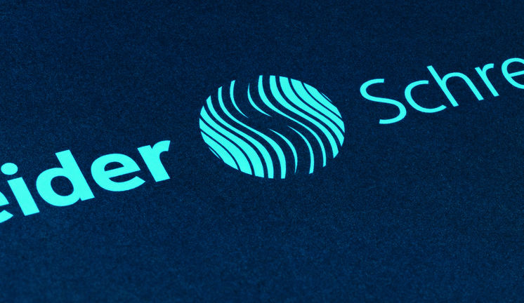
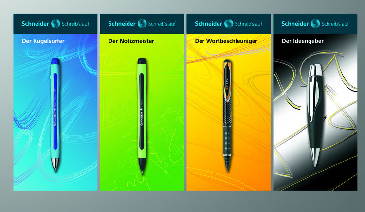
The corporate design of Schneider Schreibgeräte is derived from the world of writing: the new logo consists of lines of varying weights that form an “S” to symbolize handwriting. The combination of dark blue, a common ink color, and light blue is unique in the market. The tagline, “Schreib’s auf” (“Write it”), reflects the Schneider principle “Jeder Gedanke ist es wert, aufgeschrieben zu werden” (“Every thought is worth writing down.”). Catchy product names such as “Der Kugelsurfer” (“The page surfer”) or “Der Notizmeister” (“The note master”) create positive associations with important product features to set them apart from the competition.

RELATED PROJECTS